Virtual Gallery Interaction
2024
Target Platform | Microsoft Mesh (pre-release) Desktop & VR
Company | Accenture
Role | VR Interaction Designer
Interaction design
Iterative prototyping
Dev Tool | Unity (C#)
Task Duration | 1-2 Weeks
This is a static gallery image without responsivity. When the user is close, pixelations show, especially when the given image is low-resolution.
The Brief
We have a virtual gallery that is currently void of interactivity.
PART 1 | Design and prototype an interactivity that gives more information about the artwork. The interaction should go beyond a typical physical gallery experience.
PART 2 | Design the interaction in a way that helps prevent viewers from seeing pixelation. Unlike physical art, virtual art is bound by resolution. If you look closely at a digital image, you will end up seeing pixelation at some point. We will not enforce minimum resolution for situations when there are only lo-fi images available.
Spaces for Enhancement
To start design, I thought of some aspects that could enhance the digital gallery experience by thinking back to some pain points I experienced in physical galleries.
1. Legible and Direct Descriptions
In physical galleries, viewers need to lean in to read the small description panel at a corner of the artwork to get more context. Can we make it that viewers can see the artwork and read the description at the same time?
2. Images as Thumbnails
In physical galleries, it’s difficult to see smaller artwork from far away. Taking advantage of the digital setting, can we use the digital thumbnail system and resize images to make them function as legible thumbnails from far away, but then resize to a proper viewing proportion when the user is close?
—> These ideas led me to try applying responsive / adaptive UI concepts to the gallery images.
Spatially Responsive UI
Responsive design is an approach to web design in which the interface adapts to the device's layout, facilitating usability, navigation and information seeking.
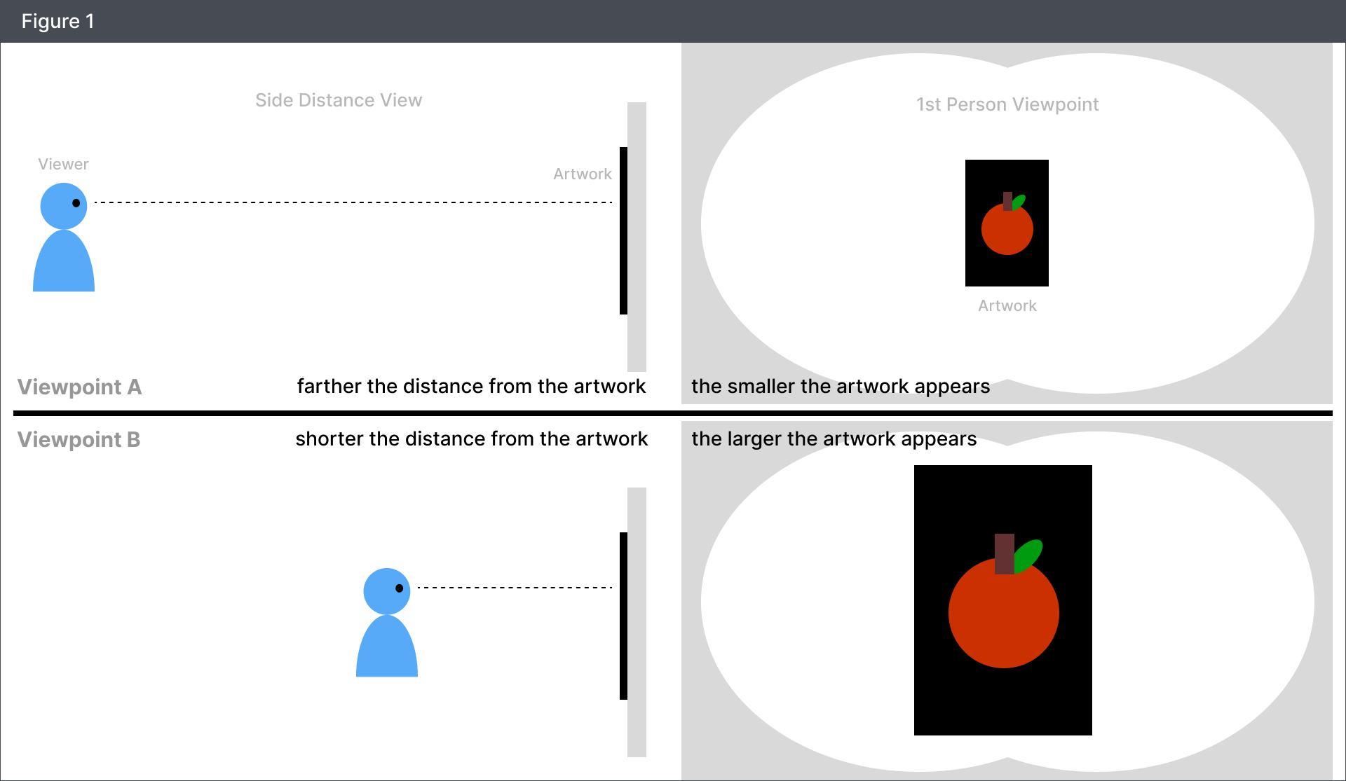
If we think of the flat artwork as an interface, it is an interface that is constantly re-sizing based on the position from which you are viewing the artwork. From viewpoint A, the artwork is the size of a tablet, whereas from viewpoint B, the artwork is the size of a larger TV.
In a responsive website, images are usually resized to fill the mobile screen and more text and detail is added in the desktop version.
If we take this approach, we can scale the art content down when users come close (to keep resolution) and add on additional content for more information like this:
So with this idea in mind, I set up a few prototypes to test the feel of the interaction.
Prototype Tests
In the first iteration, I focused on testing how responsive content re-sizing feels in 3D space.
Iteration 1: Distance Based Resize - Smooth
This test shows the image resizing based on how close the user is to the image.
🟢 The effect prevented users from seeing pixelation in the image
🔴The effect made some users feel as if the image was being elusive
🔴Some testers experienced mild motion sickness
💡IDEA Can we try a stepped approach to alleviate motion sickness?
💡IDEA Users want more detail when they approach something. Can we try an additive approach?
Iteration 1: Distance Based Resize - Stepped
This test was a spinoff from the previous test to see if a stepped effect could alleviate motion sickness.
🟢 Testers who experienced motion sickness from the previous text expressed that this iteration felt stable.
💭INSIGHT In responsive sizing, stepped animations are more stable than smooth ongoing animations.
Iteration 2: Poster Swap
I tested the initial design of the poster swap effect to see if this route feels better.
🟢The simplicity is clean
🔴Viewers had to look up and down instead of sideways (horizontal head movement is less straining)
🔴The effect did not fully remedy the fact that we are taking away information (image size) as the user approaches the image.
💭INSIGHT A single step transition is less distracting than multi-stepped transitions.
💡IDEA Can we make the image and text legible within the user’s horizontal viewscape?
Final Prototype
Iteration 3: Anchor Image + Popup
I landed at this effect combining the previous explorations.
🟢I kept the main image and blurred it out so that it stays to act as a visual anchor.
🟢Then I added in an animated popup with a smaller image that users can look closely at, in addition to a text box for descriptions.
🟢These elements were spread out horizontally so that the user could easily intake information without any vertical head movement.
This effect checked all the boxes for the type of interactivity that the team was looking for😊🎉
Iteration 3: Anchor Image + Popup (Low-res)
This is a test of the previous effect with low-res images to test how it would look with low-res images.
🟢It proved that this effect will work well with low-res images as well, as it hides the pixelation issue when users come too close.


